Showing posts with label dataviz. Show all posts

Wednesday, August 26, 2020

Jupyter: JUlia PYThon and R

it's "ggplot2", not "ggplot", but it is ggplot()


Did you know that @projectJupyter's Jupyter Notebook (and JupyterLab) name came from combining 3 programming languages: JUlia, PYThon and R.

Readers of my blog do not need an introduction to Python. But what about the other 2?  

Today we will talk about R. Actually, R and Python, on the Raspberry Pi.

R Origin

R traces its origins to the S statistical programming language, developed in the 1970s at Bell Labs by John M. Chambers. He is also the author of books such as Computational Methods for Data Analysis (1977) and Graphical Methods for Data Analysis (1983). R is an open source implementation of that statistical language. It is compatible with S but also has enhancements over the original.


A quick getting started guide is available here: https://support.rstudio.com/hc/en-us/sections/200271437-Getting-Started


Installing Python

As a recap, in case you don't have Python 3 and a few basic modules, the installation goes as follow (open a terminal window first):


pi@raspberrypi: $ sudo apt install python3 python3-dev build-essential

pi@raspberrypi: $ sudo pip3 install jedi pandas numpy


Installing R

Installing R is equally easy:


pi@raspberrypi: $ sudo apt install r-recommended


We also need to install a few development packages:


pi@raspberrypi: $ sudo apt install libffi-dev libcurl4-openssl-dev libxml2-dev


This will allow us to install many packages in R. Now that R is installed, we can start it:


pi@raspberrypi: $ R

Installing packages

Once inside R, we can install packages using install.packages('name') where name is the name of the package. For example, to install ggplot2 (to install tidyverse, simply replace ggplot2 with tidyverse):

> install.packages('ggplot2')


To load it:


> library(ggplot2)

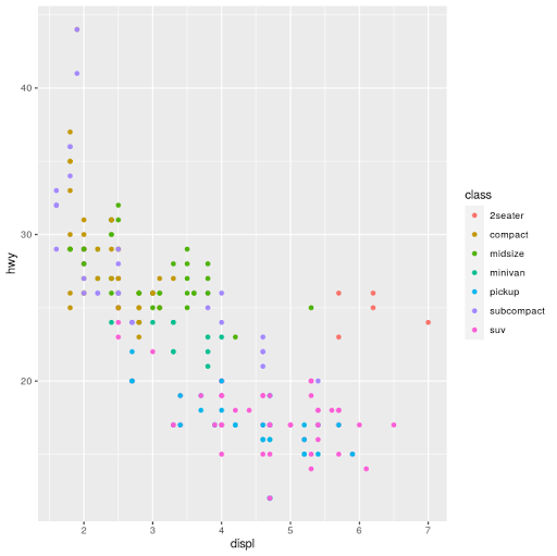
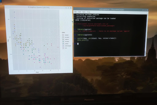
And we can now use it. We will use the mpg dataset and plot displacement vs highway miles per gallon and set the color to:

>ggplot(mpg, aes(displ, hwy, colour=class))+

 geom_point()


Combining R and Python

We can go at this 2 ways, from Python call R, or from R call Python. Here, from R we will call Python.

First, we need to install reticulate (the package that interfaces with Python):

> install.packages('reticulate')

And load it:

> library(reticulate)

We can verify which python binary that reticulate is using:

> py_config()

 Then we can use it to execute some python code. For example, to import the os module and use os.listdir(), from R we do ($ works a bit in a similar fashion to Python's .):

> os <- import("os")
> os$listdir(".")

Or even enter a Python REPL:

> repl_python()
>>> import pandas as pd

>>>


Type exit to leave the Python REPL.

One more trick: Radian

we will now exit R (quit()) and install radian, a command line REPL for R that is fully aware of the reticulate and Python integration:

pi@raspberrypi: $ sudo pip3 install radian


pi@raspberrypi: $ radian

This is just like the R REPL, only better. And you can switch to python very quickly by typing ~:

r$> ~

As soon as the ~ is typed, radian enters the python mode by itself:

r$> reticulate::repl_python()

>>> 

Hitting backspace at the beginning of the line switches back to the R REPL:

r$> 


I'll cover more functionality in a future post.


Francois Dion

Sunday, March 11, 2018

Are you smarter than a fifth grader?

"the editorial principle that nothing should be given both graphically and in tabular form has to become unacceptable" - John W. Tukey

Back to school

In the United States, most fifth grade students are learning about a fairly powerful type of visualization of data. In some states, it starts at an even younger age, in the 4th grade. As classwork and homework, they will produce many of these plots:


They are called stem-and-leaf displays, or stem-and-leaf plots. The left side of the vertical bar is the stem, and the right side, the leaves. The key or scale is important as it indicates the multiplier. The top row in the image above has a stem of 2 and leaves 0,6 and 7, representing 20, 26 and 27. Invented by John W. Tukey in the 1970's (see the statistics section of part II and the classics section of part V of my "ex-libris" series), few people use them once they leave school. Doing stem-and-leaf plots by hand is not the most entertaining thing to do. The original plot was also limited to handling small data sets. But there is a variation on the original display that gets around these limitations.

"Data! Data! Data!"

Powerful? Why did I say that in the first paragraph?

And why should stem-and-leaf plots be of interest to students, teachers, analysts, data scientists, auditors, statisticians, economists, managers and other people teaching, learning or working with data? There are a few reasons, with the two most important being:
  • they represent not only the overall distribution of data, but the individual data points themselves (or a close approximation)
  • They can be more useful than histograms as data size increases, particularly on long tailed distributions


An example with annual salaries

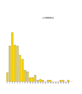
We will look at a data set of the salaries for government employees in Texas (over 690,000 values, from an August 2016 snapshot of the data from the Texas Tribune Salary Explorer). From this we create a histogram, one of the most popular plot for looking at distributions. As can be seen, we can't really tell any detail (left is Python Pandas hist, right is R hist):


It really doesn't matter the language or software package used, we get one very large bar with almost all the observations, and perhaps (as in R or seaborn), a second tiny bar next to it. A box plot (another plot popularized by John Tukey) would have been a bit more useful here adding some "outliers" dots. And, how about a stem-and-leaf plot? We are not going to sort and draw something by hand with close to 700,000 values...

Fortunately, I've built a package (python modules plus a command line tool) that handles stem-and-leaf plots at that scale (and much, much larger). It is available from http://stemgraphic.org and also from github (the code has been available as open source since 2016) and pypi (pip install stemgraphic).
So how does it look for the same data set?


Now we can see a lot of detail. Scale was automatically found to be optimal as 10000, with consecutive stems ranging from 0 to 35 (350000). We can read numbers directly, without having to refer to a color coded legend or other similar approach. At the bottom, we see a value of 0.00 (who works and is considered employed for $0 annual income? apparently, quite a few in this data set), and a maximum of $5,266,667.00 (hint, sports related), we see a median of about $42K and we see multiple classes of employees, ranging from non managerial, to middle management, upper management and beyond ($350,000+). We've limited the display here to 500 observations, and that is what the aggregate count on the leftmost column tells us. Notice also how we have a convenient sub-binning going on, allowing us to see which $1000 ranges are more common. All this from one simple display. And of course we can further trim, zoom, filter or limit what data or slice of data we want to inspect.

Knowing your data (particularly at scale) is a fundamental first step to turning it into insight. Here, we were able to know our data a lot better by simply using the function stem_graphic() instead of hist() (or use the included stem command line tool - compatible with Windows, Mac OS and Linux).

Tune in next episode...

Customers already using my software products for data governance, anomaly detection and data quality are already familiar with it. Many other companies, universities and individuals are using stemgraphic in one way or another. For everybody else, hopefully this has raised your interest, you'll master this visualization in no time, and you'll be able to answer the title question affirmatively...

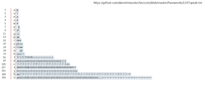
Stemgraphic has another dozen types of visualizations, including some interactive and beyond numbers, adding support for categorical data and for text (as of version 0.5.x). In the following months I'll talk a bit more about a few of them.


Francois Dion
@f_dion

N.B. This article was originally published on LinkedIn at:

https://www.linkedin.com/pulse/you-smarter-than-fifth-grader-francois-dion/

Tuesday, February 27, 2018

Stemgraphic v.0.5.x: stem-and-leaf EDA and visualization for numbers, categoricals and text


 Stemgraphic open source


In 2016 at PyDataCarolinas, I open-sourced my stem-and-leaf toolkit for exploratory data analysis and visualization. Later, in October 2016 I had posted the link to the video.


Stemgraphic.alpha


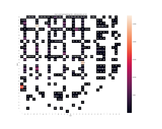
With the 0.5.x releases, I've introduced the categorical and text support. In the next few weeks, I'll be introducing some of the features, particularly those found in the new stemgraphic.alpha module of the stemgraphic package, such as back-to-back plots and stem-and-leaf heatmaps:


But if you want to get started, check out stemgraphic.org, and the github repo (especially the notebooks).

Github Repo

https://github.com/fdion/stemgraphic


Francois Dion
@f_dion

Friday, August 11, 2017

Readings in Visualization

"Ex-Libris" part V: Visualization


Part 5 of my "ex-libris" of a Data Scientist is now available. This one is about visualization.

Starting from a historical perspective, particularly of statistical visualization, and covering a few classic must have books, the article then goes on to cover graphic design, cartography, information architecture and design and concludes with many recent books on information visualization (specific Python and R books to create these were listed in part IV of this series). In all, about 66 books on the subject.

Just follow the link to the LinkedIn post to go directly to it:


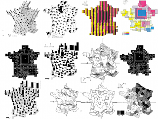
From Jacques Bertin’s Semiology of Graphics

"Le plus court croquis m'en dit plus long qu'un long rapport", Napoleon Ier

See also

Part I was on "data and databases": "ex-libris" of a Data Scientist - Part i
Part II, was on "models": "ex-libris" of a Data Scientist - Part II

Part III, was on "technology": "ex-libris" of a Data Scientist - Part III
Part IV, was on "code": "ex-libris" of a Data Scientist - Part IV
Part VI will be on communication. Bonus after that will be on management / leadership.
Francois Dion
@f_dion

P.S.
Je vais aussi avoir une liste de publications en francais
En el futuro cercano voy a hacer una lista en espanol tambien

Thursday, October 20, 2016

Stemgraphic, a new visualization tool

PyData Carolinas 2016

At PyData Carolinas 2016 I presented the talk Stemgraphic: A Stem-and-Leaf Plot for the Age of Big Data.

Intro

The stem-and-leaf plot is one of the most powerful tools not found in a data scientist or statistician’s toolbox. If we go back in time thirty some years we find the exact opposite. What happened to the stem-and-leaf plot? Finding the answer led me to design and implement an improved graphical version of the stem-and-leaf plot, as a python package. As a companion to the talk, a printed research paper was provided to the audience (a PDF is now available through artchiv.es)

The talk


Thanks to the organizers of PyData Carolinas, videos of all the talks and tutorials have been posted on youtube. In just 30 minutes, this is a great way to learn more about stemgraphic and the history of the stem-and-leaf plot for EDA work. This updated version does include the animated intro sequence, but unfortunately the sound was recorded from the microphone, and not the mixer. You can see the intro sequence in higher audio and video quality on the main page of the website below.

Stemgraphic.org

I've created a web site for stemgraphic, as I'll be posting some tutorials and demo some of the more advanced features, particularly as to how stemgraphic can be used in a data science pipeline, as a data wrangling tool, as an intermediary to big data on HDFS, as a visual validation for building models and as a superior distribution plot, particularly when faced with non uniform distributions or distributions showing a high degree of skewness (long tails).

Github Repo

https://github.com/fdion/stemgraphic


Francois Dion
@f_dion


Tuesday, October 11, 2016

PyData Carolinas 2016 Tutorial: Datascience on the web

PyData Carolinas 2016

Don Jennings and I presented a tutorial at PyData Carolinas 2016: Datascience on the web.

The plan was as follow:

Description

Learn to deploy your research as a web application. You have been using Jupyter and Python to do some interesting research, build models, visualize results. In this tutorial, you’ll learn how to easily go from a notebook to a Flask web application which you can share.

Abstract

Jupyter is a great notebook environment for Python based data science and exploratory data analysis. You can share the notebooks via a github repository, as html or even on the web using something like JupyterHub. How can we turn the work we have done in the notebook into a real web application?
In this tutorial, you will learn to structure your notebook for web deployment, how to create a skeleton Flask application, add a model and add a visualization. While you have some experience with Jupyter and Python, you do not have any previous web application experience.
Bring your laptop and you will be able to do all of these hands-on things:
  1. get to the virtual environment
  2. review the Jupyter notebook
  3. refactor for reuse
  4. create a basic Flask application
  5. bring in the model
  6. add the visualization
  7. profit!
Now that is has been presented, the artifacts are a github repo and a youtube video.

Github Repo


https://github.com/fdion/pydata/

After the fact

The unrefactored notebook is here while the refactored one is here.
Once you run through the whole refactored notebook, you will have train and test sets saved in data/ and a trained model in trained_models/. To make these available in the tutorial directory, you will have to run the publish.sh script. On a unix like environment (mac, linux etc):
chmod a+x publish.sh
./publish.sh

Video

The whole session is now on youtube: Francois Dion & Don Jennings Datascience on the web

Francois Dion
@f_dion

Sunday, September 18, 2016

Something for your mind: Polymath Podcast launched


Some episodes
will have more Art content, some will have more Business content, some will have more Science content, and some will be a nice blend of different things. But for sure, the show will live up to its name and provide you with “something for your mind”. It might raise more questions than it answers, and that is fine too.

Episode 000
Listen to Something for your mind on http://Artchiv.es

Francois Dion
@f_dion

Thursday, December 31, 2015

And thus ends 2015...

Yet it is also just the beginning

This is not going a long review of the year. Perhaps in January I'll do that. But I did want to point out that it was a good year for python. Earlier this month I looked at the TIOBE ratings for Python, R and Scala, the main languages I use on a regular basis (and in decreasing order of use by me - I might do java, C++ or javascript on occasion, but not on a regular basis anymore):

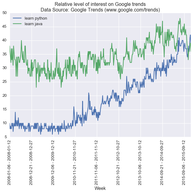
And that was a peak for Python at #4. Back in 2007, you might remember, TIOBE had named Python "Language of the year". And if we do a quick check on google trends of a good indicator of the popularity worldwide ("learn python"), we see that this is when it started to pick up some steam. For some fun, I'm comparing to "learn java" (ranked #1 on latest TIOBE rating):

Hey wait, what is going on in November / December 2015? :P

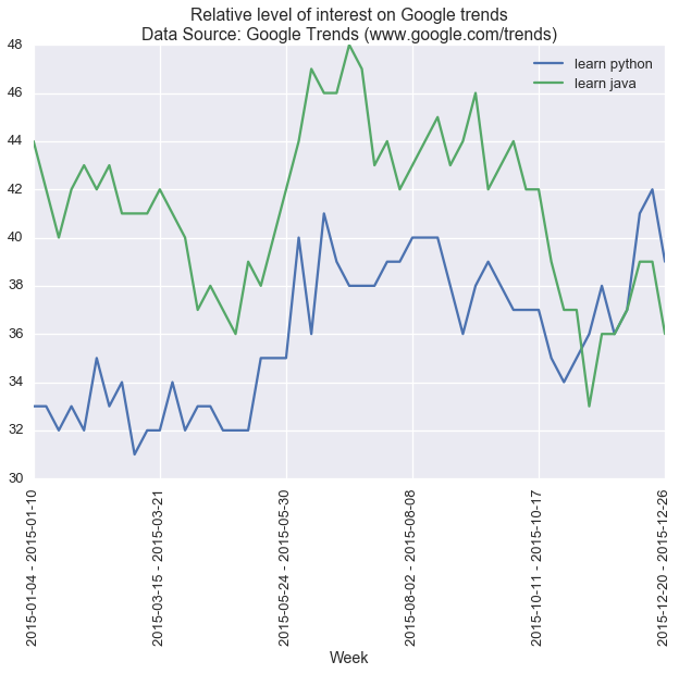
Let's zoom in and take a closer look at 2015:


It appears it might be overtaking Java there... It is quite early to really see if this is just a fluke, only the next few months will reveal this.

That credit card sized computer thingy

What is also worth mentioning is that the level of interest in learning Python and the Raspberry Pi seem to follow a similar path, but that will be for a follow up post. See you next year!

Francois Dion
@f_dion

Tuesday, December 29, 2015

Reproducible research from a book


Preamble

Sometimes, you don't have direct access to the data, or the data changes over time. 
 
Yeah, I know, scary. So that's my point in this post. Provide a URL to a "frozen" version of your data, if at all possible. Toward the end of the article I provide a link to the notebook. This repo also holds the data I used for the visualization.
 
Let's get right into it...
 
In [1]:
%matplotlib inline
import matplotlib.pyplot as plt
import pandas as pd
import seaborn as sns
sns.set_context("talk")


Reproducible visualization

In "The Functional Art: An introduction to information graphics and visualization" by Alberto Cairo, on page 12 we are presented with a visualization of UN data time series of Fertility rate (average number of children per woman) per country:

Figure 1.6 Highlighting the relevant, keeping the secondary in the background.

Book url:
The Functional Art


Let's try to reproduce this.


Getting the data

The visualization was done in 2012, but limited the visualization to 2010.

This should make it easy, in theory, to get the data, since it is historical. These are directly available as excel spreadsheets now, we'll just ignore the last bucket (2010-2015).
Pandas allows loading an excel spreadsheet straight from a URL, but here we will download it first so we have a local copy.

In [3]:
!wget 'http://esa.un.org/unpd/wpp/DVD/Files/1_Indicators%20(Standard)/
EXCEL_FILES/2_Fertility/WPP2015_FERT_F04_TOTAL_FERTILITY.XLS'
--2015-12-29 16:57:23--  http://esa.un.org/unpd/wpp/DVD/Files/
1_Indicators%20(Standard)/EXCEL_FILES/2_Fertility/
WPP2015_FERT_F04_TOTAL_FERTILITY.XLS
Resolving esa.un.org... 157.150.185.69
Connecting to esa.un.org|157.150.185.69|:80... connected.
HTTP request sent, awaiting response... 200 OK
Length: 869376 (849K) [application/vnd.ms-excel]
Saving to: 'WPP2015_FERT_F04_TOTAL_FERTILITY.XLS'

WPP2015_FERT_F04_TO 100%[=====================>] 849.00K   184KB/s   in 4.6s   

2015-12-29 16:57:28 (184 KB/s) - 
'WPP2015_FERT_F04_TOTAL_FERTILITY.XLS' saved [869376/869376]


World Population Prospects: The 2015 Revision

File FERT/4: Total fertility by major area, region and country, 1950-2100 (children per woman)
Estimates, 1950 - 2015                                
POP/DB/WPP/Rev.2015/FERT/F04                                
July 2015 - Copyright © 2015 by United Nations. All rights reserved                                
Suggested citation: United Nations, Department of Economic and Social Affairs,
Population Division (2015). 
World Population Prospects: The 2015 Revision, DVD Edition.
 
In [2]:
df = pd.read_excel('WPP2015_FERT_F04_TOTAL_FERTILITY.XLS', skiprows=16,  
                   index_col = 'Country code')
df = df[df.index < 900]
 
In [3]:
len(df)
Out[3]:
201
 
In [4]:
df.head()
Out[4]:

Index Variant Major area, region, country or area * Notes 1950-1955 1955-1960 1960-1965 1965-1970 1970-1975 1975-1980 1980-1985 1985-1990 1990-1995 1995-2000 2000-2005 2005-2010 2010-2015
Country code


108 15 Estimates Burundi NaN 6.8010 6.8570 7.0710 7.2680 7.3430 7.4760 7.4280 7.5920 7.4310 7.1840 6.908 6.523 6.0756
174 16 Estimates Comoros NaN 6.0000 6.6010 6.9090 7.0500 7.0500 7.0500 7.0500 6.7000 6.1000 5.6000 5.200 4.900 4.6000
262 17 Estimates Djibouti NaN 6.3120 6.3874 6.5470 6.7070 6.8450 6.6440 6.2570 6.1810 5.8500 4.8120 4.210 3.700 3.3000
232 18 Estimates Eritrea NaN 6.9650 6.9650 6.8150 6.6990 6.6200 6.6200 6.7000 6.5100 6.2000 5.6000 5.100 4.800 4.4000
231 19 Estimates Ethiopia NaN 7.1696 6.9023 6.8972 6.8691 7.1038 7.1838 7.4247 7.3673 7.0888 6.8335 6.131 5.258 4.5889

First problem... The book states on page 8:
--
Yet we have 201 countries (codes 900+ are regions) with complete data. We do not have a easy way to identify which countries were added to this. Still, let's move forward and prep our data.
In [5]:
df.rename(columns={df.columns[2]:'Description'}, inplace=True)
In [6]:
df.drop(df.columns[[0, 1, 3, 16]], axis=1, inplace=True) # drop what we dont need
In [7]:
df.head()
Out[7]:

Description 1950-1955 1955-1960 1960-1965 1965-1970 1970-1975 1975-1980 1980-1985 1985-1990 1990-1995 1995-2000 2000-2005 2005-2010
Country code


108 Burundi 6.8010 6.8570 7.0710 7.2680 7.3430 7.4760 7.4280 7.5920 7.4310 7.1840 6.908 6.523
174 Comoros 6.0000 6.6010 6.9090 7.0500 7.0500 7.0500 7.0500 6.7000 6.1000 5.6000 5.200 4.900
262 Djibouti 6.3120 6.3874 6.5470 6.7070 6.8450 6.6440 6.2570 6.1810 5.8500 4.8120 4.210 3.700
232 Eritrea 6.9650 6.9650 6.8150 6.6990 6.6200 6.6200 6.7000 6.5100 6.2000 5.6000 5.100 4.800
231 Ethiopia 7.1696 6.9023 6.8972 6.8691 7.1038 7.1838 7.4247 7.3673 7.0888 6.8335 6.131 5.258
In [8]:
highlight_countries = ['Niger','Yemen','India',
                       'Brazil','Norway','France','Sweden','United Kingdom',
                       'Spain','Italy','Germany','Japan', 'China'
                      ]
In [9]:
# Subset only countries to highlight, transpose for timeseries
df_high = df[df.Description.isin(highlight_countries)].T[1:]
In [10]:
# Subset the rest of the countries, transpose for timeseries
df_bg = df[~df.Description.isin(highlight_countries)].T[1:]

Let's make some art

In [11]:
# background
ax = df_bg.plot(legend=False, color='k', alpha=0.02, figsize=(12,12))
ax.xaxis.tick_top()

# highlighted countries
df_high.plot(legend=False, ax=ax)

# replacement level line
ax.hlines(y=2.1, xmin=0, xmax=12, color='k', alpha=1, linestyle='dashed')

# Average over time on all countries
df.mean().plot(ax=ax, color='k', label='World\naverage')

# labels for highlighted countries on the right side
for country in highlight_countries:
    ax.text(11.2,df[df.Description==country].values[0][12],country)
    
# start y axis at 1
ax.set_ylim(ymin=1)
Out[11]:
(1, 9.0)
For one thing, the line for China doesn't look like the one in the book. Concerning. The other issue is that there are some lines that are going lower than Italy or Spain in 1995-2000 and in 2000-2005 (majority in the Balkans) and that were not on the graph in the book, AFAICT:
In [12]:
df.describe()
Out[12]:

1950-1955 1955-1960 1960-1965 1965-1970 1970-1975 1975-1980 1980-1985 1985-1990 1990-1995 1995-2000 2000-2005 2005-2010
count 201.00000 201.000000 201.000000 201.000000 201.000000 201.000000 201.000000 201.000000 201.000000 201.000000 201.000000 201.000000
mean 5.45045 5.495005 5.491424 5.265483 4.994911 4.657349 4.403227 4.122837 3.762972 3.412293 3.141556 2.992349
std 1.64388 1.674181 1.734726 1.849984 1.944553 2.039995 2.033660 1.952100 1.849278 1.791151 1.701363 1.562150
min 1.98000 1.950000 1.850000 1.810000 1.623000 1.407900 1.427300 1.349700 1.240000 0.870000 0.825200 0.937900
25% 4.27700 4.201000 4.273100 3.447000 2.990000 2.540200 2.301500 2.230000 2.050000 1.889100 1.806100 1.818200
50% 5.99500 6.134100 6.129700 5.950000 5.470000 4.974900 4.370000 3.800000 3.343000 2.941500 2.600000 2.479300
75% 6.70000 6.764000 6.800000 6.707000 6.700000 6.525000 6.315000 5.900000 5.217000 4.637000 4.210000 3.980000
max 8.00000 8.150000 8.200000 8.200000 8.284000 8.500000 8.800000 8.800000 8.200000 7.746600 7.720900 7.678700
In [13]:
df[df['1995-2000']<1.25]
Out[13]:

Description 1950-1955 1955-1960 1960-1965 1965-1970 1970-1975 1975-1980 1980-1985 1985-1990 1990-1995 1995-2000 2000-2005 2005-2010
Country code


344 China, Hong Kong SAR 4.4400 4.7200 5.3100 3.6450 3.2900 2.3100 1.7150 1.3550 1.2400 0.8700 0.9585 1.0257
446 China, Macao SAR 4.3858 5.1088 4.4077 2.7367 1.7930 1.4079 1.9769 1.9411 1.4050 1.1160 0.8252 0.9379
100 Bulgaria 2.5264 2.2969 2.2171 2.1304 2.1573 2.1927 2.0149 1.9458 1.5527 1.2008 1.2404 1.5005
203 Czech Republic 2.7383 2.3765 2.2088 1.9573 2.2108 2.3588 1.9660 1.9008 1.6455 1.1670 1.1870 1.4286
643 Russian Federation 2.8500 2.8200 2.5500 2.0200 2.0300 1.9400 2.0400 2.1210 1.5450 1.2470 1.2980 1.4389
804 Ukraine 2.8100 2.7000 2.1346 2.0204 2.0789 1.9798 2.0040 1.8968 1.6208 1.2404 1.1455 1.3828
428 Latvia 2.0000 1.9500 1.8500 1.8100 2.0000 1.8745 2.0293 2.1309 1.6322 1.1722 1.2856 1.4926
380 Italy 2.3550 2.2900 2.5040 2.4989 2.3227 1.8856 1.5245 1.3497 1.2715 1.2239 1.2974 1.4169
705 Slovenia 2.6800 2.3833 2.3354 2.2650 2.1999 2.1632 1.9280 1.6517 1.3335 1.2483 1.2114 1.3841
724 Spain 2.5300 2.7000 2.8100 2.8400 2.8500 2.5500 1.8800 1.4600 1.2800 1.1900 1.2900 1.3904
In [14]:
df[df['2000-2005']<1.25]
Out[14]:

Description 1950-1955 1955-1960 1960-1965 1965-1970 1970-1975 1975-1980 1980-1985 1985-1990 1990-1995 1995-2000 2000-2005 2005-2010
Country code


344 China, Hong Kong SAR 4.4400 4.7200 5.3100 3.6450 3.2900 2.3100 1.7150 1.3550 1.2400 0.8700 0.9585 1.0257
446 China, Macao SAR 4.3858 5.1088 4.4077 2.7367 1.7930 1.4079 1.9769 1.9411 1.4050 1.1160 0.8252 0.9379
410 Republic of Korea 5.0500 6.3320 5.6300 4.7080 4.2810 2.9190 2.2340 1.6010 1.6960 1.5140 1.2190 1.2284
100 Bulgaria 2.5264 2.2969 2.2171 2.1304 2.1573 2.1927 2.0149 1.9458 1.5527 1.2008 1.2404 1.5005
203 Czech Republic 2.7383 2.3765 2.2088 1.9573 2.2108 2.3588 1.9660 1.9008 1.6455 1.1670 1.1870 1.4286
498 Republic of Moldova 3.5000 3.4400 3.1500 2.6600 2.5600 2.4400 2.5500 2.6400 2.1110 1.7000 1.2378 1.2704
703 Slovakia 3.5022 3.2427 2.9110 2.5410 2.5067 2.4640 2.2710 2.1537 1.8667 1.4010 1.2205 1.3100
804 Ukraine 2.8100 2.7000 2.1346 2.0204 2.0789 1.9798 2.0040 1.8968 1.6208 1.2404 1.1455 1.3828
70 Bosnia and Herzegovina 4.7700 3.9086 3.6830 3.1372 2.7332 2.1900 2.1200 1.9100 1.6500 1.6261 1.2155 1.2845
705 Slovenia 2.6800 2.3833 2.3354 2.2650 2.1999 2.1632 1.9280 1.6517 1.3335 1.2483 1.2114 1.3841

The other thing that I really need to address is the labeling. Clearly we need the functionality to move labels up and down to make them readable. Collision detection, basically. I'm surprised this functionality doesn't exist, because I keep bumping into that. Usually, I can tweak the Y pos by a few pixels, but in this specific case, there is no way to do that.
So, I guess I have a project for 2016...
 

The original jupyter notebook can be downloaded here:
 
Francois Dion
@f_dion